Abstract
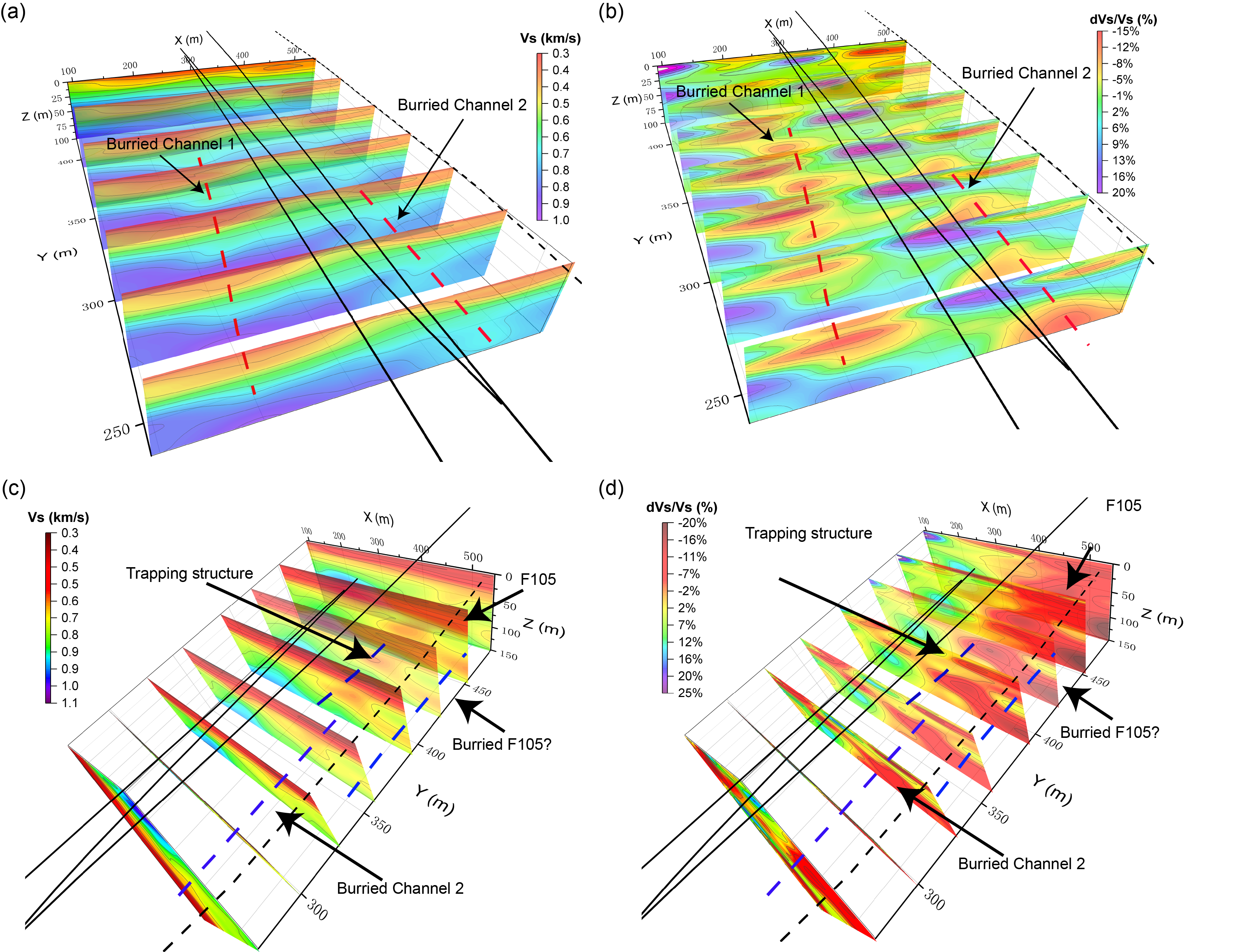
In our previous methodological work, we proposed the FJ-PST method to address the bifurcation issues commonly encountered when imaging complex subsurface structures. In this study, we applied the FJ-PST method to image the Sagebrush Flat (SGB) site along the Clark fault (CF) strand of the San Jacinto fault zone, refining its \(v_s\) structure. The imaging results exhibit high resolution, revealing two buried low-velocity channels, a trapping structure, an inferred fault, and notable lateral velocity variations along CF branches. Given the enhanced detail and resolution provided by this method, we believe it is well-suited for complex subsurface tomography.
Geological Setting
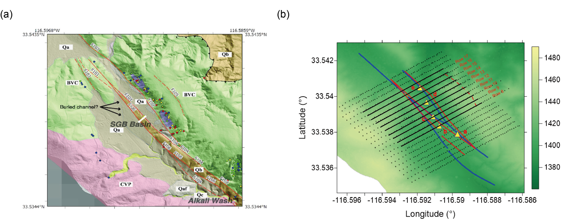
In this study, ambient noise data recorded by a dense Nodal array around the Clark branch of the SJFZ at the Sagebrush Flats (SGB) was used for tomography. The array had an average 10m row interstation and 30m row separation (Ben-Zion et al., 2015). (Wade, 2018) analyzed the lithology and surface fault traces at the SGB site Based on the \(v_s\) properties (Mordret et al., 2019) and surface geological mapping results, as depicted in Figure 1(a) (edit from (Share et al., 2020)). Three exposed faults (F102, F104, F106) traverse the array from northwest to southeast, forming the branches of Clark fault, while another inferred but not field-observed fault (F105) lies to the northeast.
Figure 1. Geological and topographic data are analyzed here. (a) Lithology and damage intensity mapping at the surface modified from Share et al. (2020). The main geological/lithological units are CVP—Coahuila Valley Pluton, BVC—Burnt Valley Complex, Qa—Quaternary sediments, and Qb—Plio-Pleistocene Bautista Formation. More differentiated sediments are Qaf—alluvial fan and Qc—colluvium. The colored dots indicate the damage intensity of the rock. The red solid line represents the strike-slip fault observed from the field by Wade (2018), and the red dashed line represents the inferred faults not observed in the field. (b) Distribution of the dense seismic array used in this study. The background color is the relief calculated within a 10 m radius and topography from the B4 lidar project (Bevis et al., 2005). The blue solid lines are the surface traces for the trifurcation faults, referred to as F106, F104, and F102 from left to right by USGS (Dor et al., 2006). The red solid lines are the same trifurcation faults Wade (2018) obtained after a joint analysis of different research. The red dashed line represents the inferred fault trace. The black solid lines tagged by row numbers indicate the reference locations in Figure 8 and 9.
Workflow of the FJ-PST
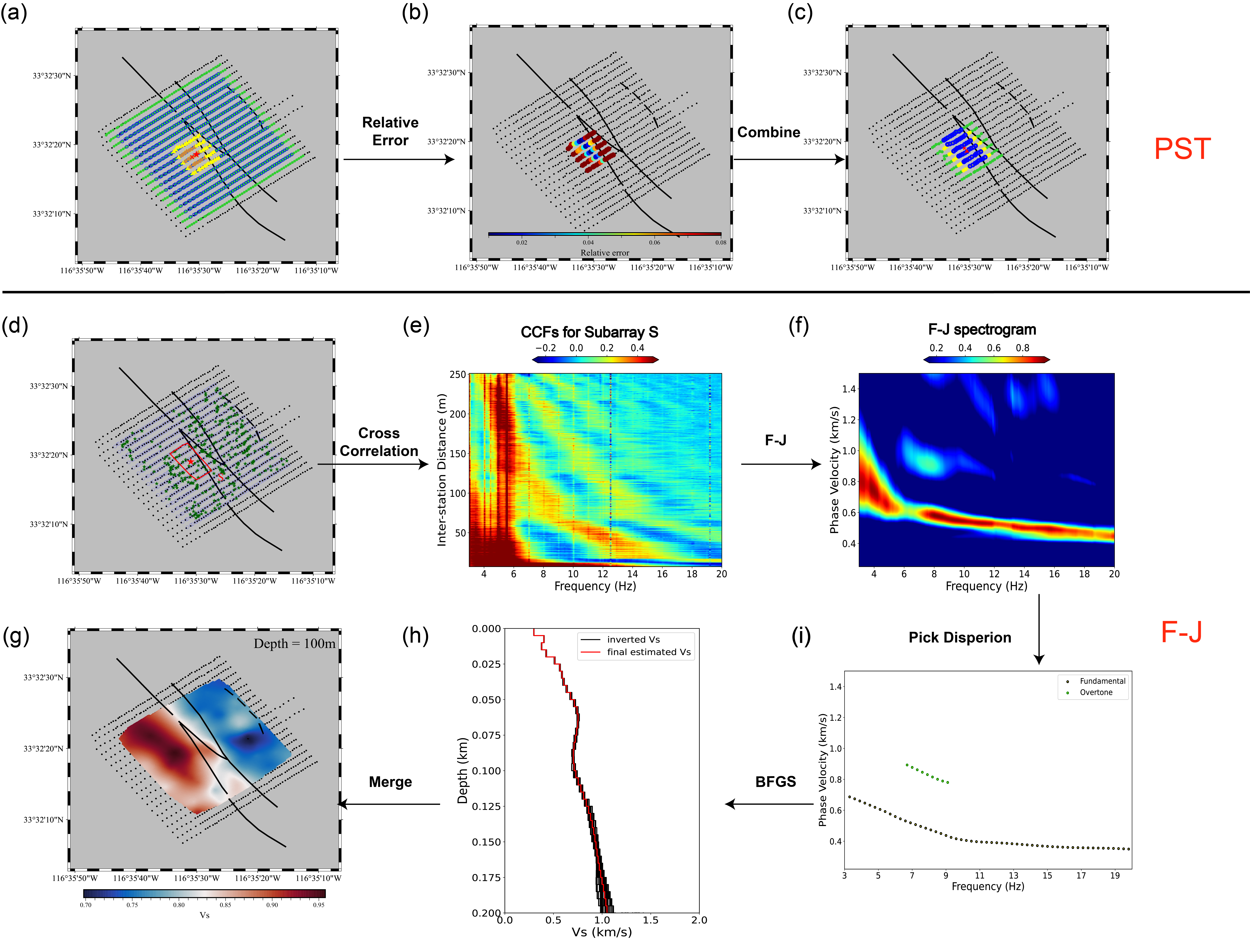
The workflow of integrating FJ-PST to obtain a 3D \(v_s\) model mainly consists of four steps (as shown in Figure 2 for a cartoon and Figure 3 for the application to the SGB array):
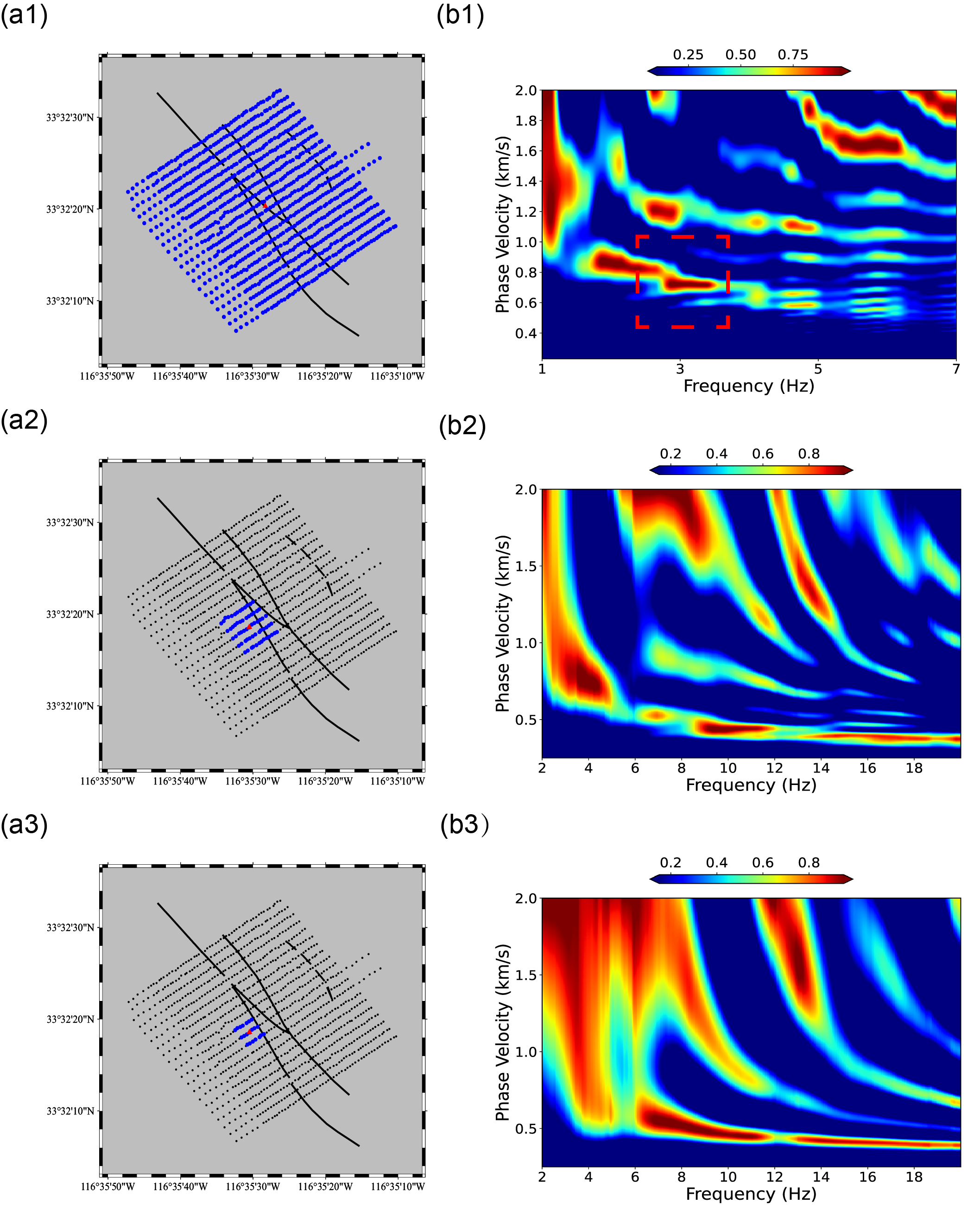
First, subarrays are adaptively generated using the PST method. To determine an appropriate target size, the entire array is initially analyzed using the F-J method. The dispersion spectrogram of the entire array (Figure 4(b1)) showed the first bifurcation is around 3 Hz, indicating the minimum resolvable frequency. Based on the maximum phase velocity of approximately 900 m/s observed in Figure 4(b1), the minimum aperture of the subarray estimated by ((4) in FJ-PST) is about 150m. Given the near-square shape of the array and its uniform station spacing, square-shaped targets with a side length of 120 m (maximum aperture 170 m) were selected.
Probes are set to squares of 60 m because bifurcation typically occurs between around 9 Hz and 16 Hz (Figure 4(b2)), requiring a subarray aperture of around 50m by ((4) in FJ-PST), based on the highest phase velocity of approximately 800 m/s observed among all targets at 9Hz. Setting probes to squares of 60 m ensures accurate extraction of dispersion curves for this frequency range. Subsequently, all possible targets and probes are generated to maximize data utilization and enhance lateral resolution, as shown in Figures 3(a)-(c).
Second, the F-J transform is applied to the cross-correlation functions (CCFs) of each subarray to obtain dispersion spectrograms (Figures 3(e)–(f)). Third, multimodal dispersion curves are picked and examined, and the BFGS method is used to invert these curves to derive the 1D V_s structure for each subarray (Figures 3(h)–(i)). Finally, all 1D \(V_{s}\) structures are merged using Kriging interpolation to construct the final 3D \(V_{s}\) model (Figure 3(g))
Figure 2. Illustration of the Partition Similarity Test (PST) concept. (a) Target and Probe Definition: In the F-J method, the cross-correlation functions (CCFs) of a seismic station array are used to estimate the velocity structure at its centroid. The "target" refers to a relatively large seismic station array (black hollow circles) spanning multiple one-dimensional velocity structures (orange and green background regions). The target can be divided into smaller subarrays, called "probes" (e.g., three-station groups in this case), which enable localized dispersion curve extraction around the target centroid. Among these, the probe closest to the target centroid is designated as the reference probe (Probe A). The relative error (RE) of all other probes is calculated with respect to Probe A. Probes with the same velocity structure as Probe A are marked in cyan, those spanning two structures are marked in yellow, and those covering a different structure are marked in red. (b) Relative Error (RE) Calculation: This panel illustrates the RE calculation and a hypothetical fundamental mode dispersion curve distributions of the probes in (a). Red dots and blue triangles represent dispersion points from an outlier and the reference probe, respectively. The gray "slashed" area denotes the absolute error (AE) between the curves. Dividing the AE by the gray area is defined as the RE. (c) New Subarray Formation: Probes with similar dispersion curves (cyan centroids in (a) and corresponding cyan curves in (b)) are combined to form a new subarray. Note that this process excludes certain stations from the target, causing a centroid shift in the new subarray.
Figure 3. Illustration of 3D Vs model retrieval from ambient noise data using FJ-PST in this study. (a) The set of targets and probes. Black dots represent array stations, solid lines indicate fault branches, and dashed lines mark inferred faults as shown in Figure 1(a). Green dots and hollow blue circles indicate the centroids of all targets and probes, respectively, used in this study. Yellow triangles represent stations of a sample target, while brown triangles show stations of a sample probe used to test this target. The centroid of the sample target and probe is marked with a red star and a red cross, respectively. (b) The distribution of relative error (RE) for probes within this target. (c) Generated Subarray for the Sample Target. Yellow dots show stations of the sample target, green dots represent stations from all probes for the target, and blue dots mark stations in the resulting subarray. (d) Distribution of Centroids for Targets and Generated Subarrays by Partition Similarity Test. Blue hollow circles mark the centroids of all targets, and green stars denote centroids of the generated subarrays. The letter S refers to the sample subarray, outlined in red, with its centroid shown by a red star. (e) The frequency-domain Cross-Correlation Functions (CCFs) of subarray S. (f) F-J spectrogram calculated from CCFs of subarray S. (g) A depth slice at 100m of the final 3D Vs model by merging 1D Vs models at all reference locations. (h) 1D Vs model from the inversion of multimodal dispersion curves with the Broyden-Fletcher-Goldfarb-Shanno method. (i) Dispersion curves picked from the F-J spectrogram in (f).
Figure 4. Comparison of the F-J spectrogram of different subarray sizes. The column index (a) represents the subarray distribution, where the blue dots are the stations of the subarray, the black dots are the stations of the entire array, and the red dot is the centroid of the subarray; and (b) represents corresoponding F-J spectrogram. The row index 1 represents the entire array, 2-3 represents example square-shape subarry with lengths of 120m and 60m that we chose as target and probe. The red dash square indicates the first bifurcation range of the dispersion spectrogram using the entire array.
Results
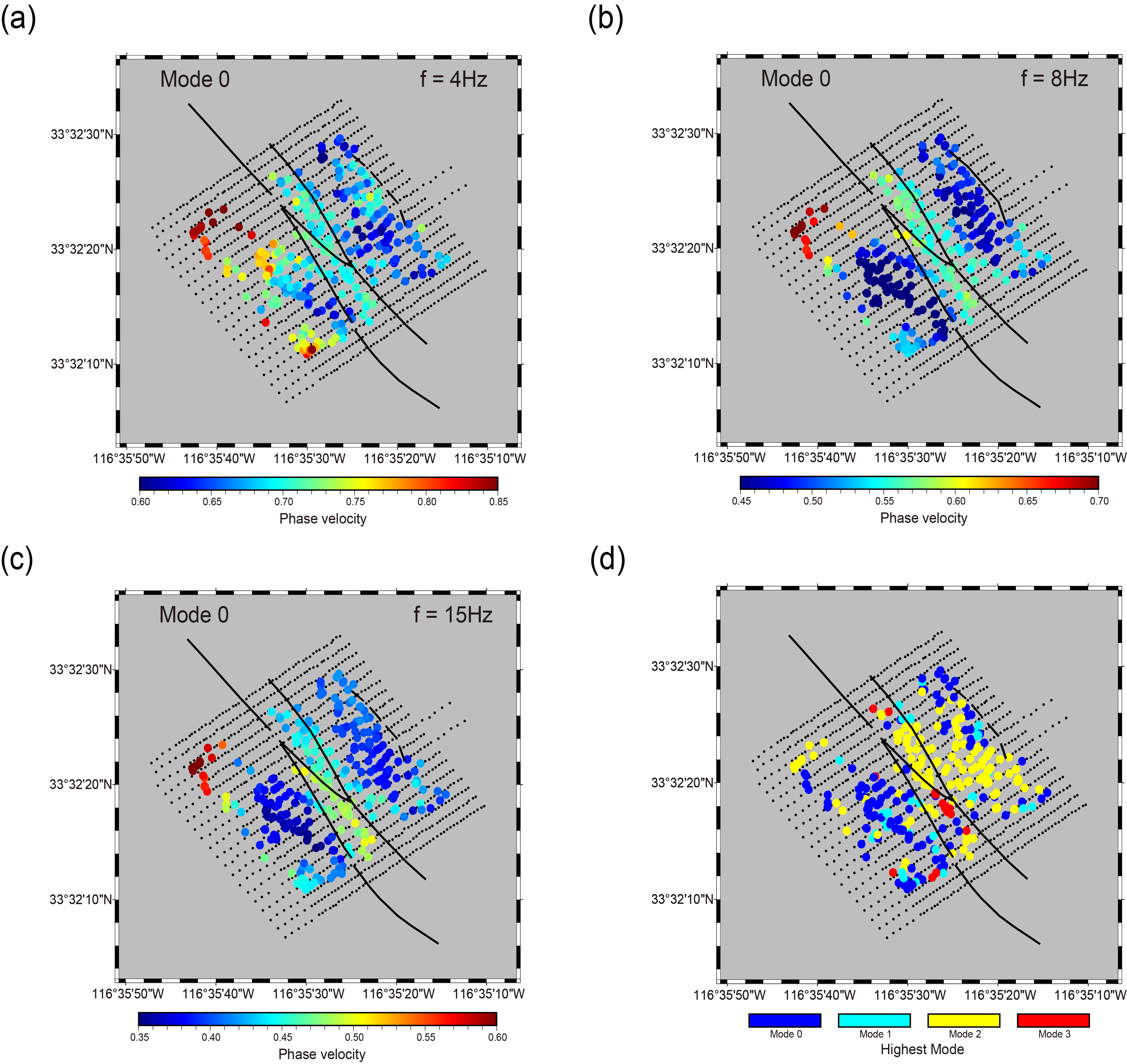
Figure 5. Phase velocity for the fundamental mode at (a) 4Hz, (b) 8Hz, and (c) 15Hz. The highest mode extracted for each subarray are shown in (d)
Figure 6. Representative vertical slices of the final 3D (a) Vs model and (b) Vs perturbation for a left perspective, and (c) Vs model and (d) Vs perturbation for a right perspective from the inversion of multimodal dispersion curves along the trifurcation area. The black solid lines represented the fault traces of USGS (Dor et al., 2006), and the black dashed line represented the inferred fault trace F105 by Wade (2018). The red dashed lines represent two high-resolution buried channels revealed in this model, and the blue dashed lines represent the trapping structure, buried channel 2, and a possible buried F105.
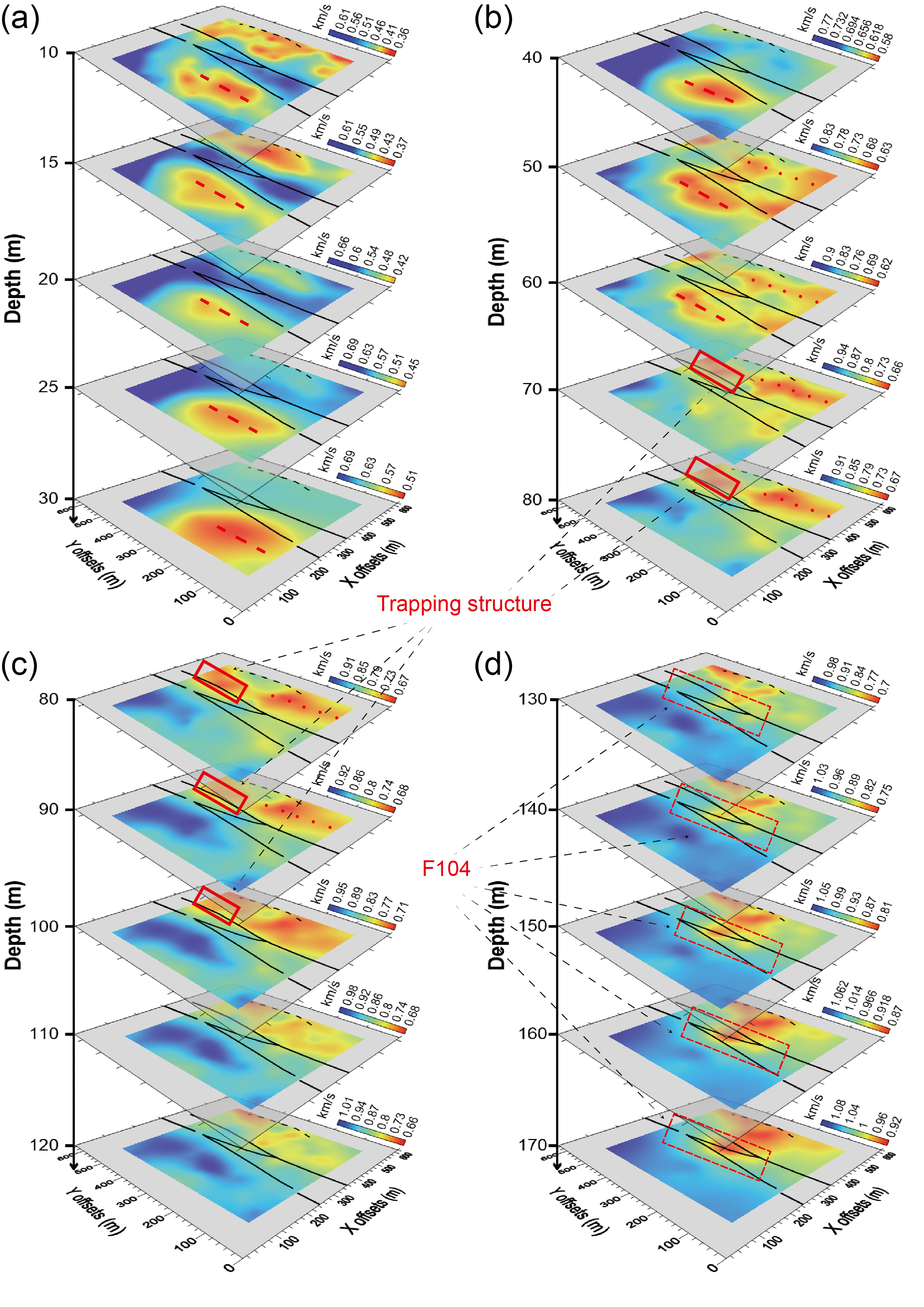
Figure 7. The depth slices of the final 3D Vs model from the inversion of multimodal dispersion curves from (a) 10m to 30m, (b) 40m to 80m, (c) 80m to 120m, and (d) 130m to 170m. The red dash line represents the buried channel 1. The red dotted line represents the buried channel 2.
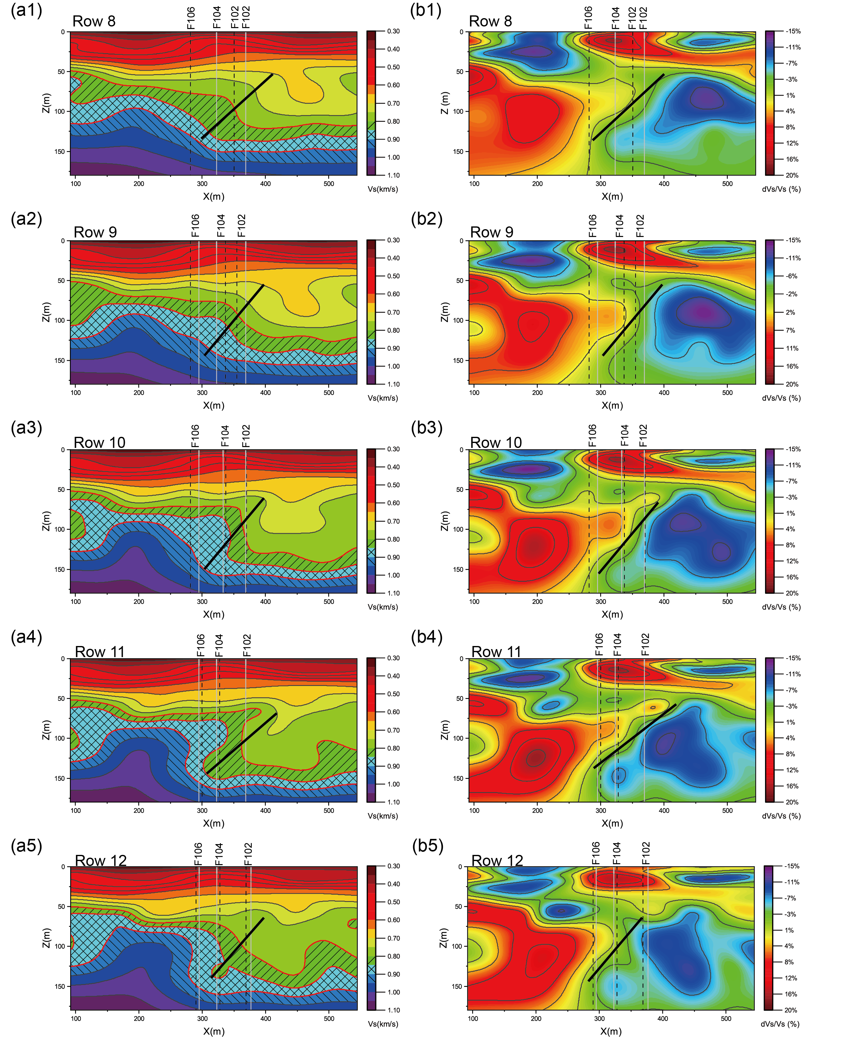
Figure 8. The vertical slices of (a) Vs model and (b) Vs perturbation within the fault trifurcation area (referenced in Figure 1(b) from Row 8 to Row 12). The vertical black dash lines and gray solid lines in each plot represent the fault traces estimated by USGS Dor et al. (2006) and Wade (2018), respectively. Three velocity contours are typically marked in (a) and (c) as different filling lines to visualize the variations better. The black solid lines indicate the reverse fault mechanism.
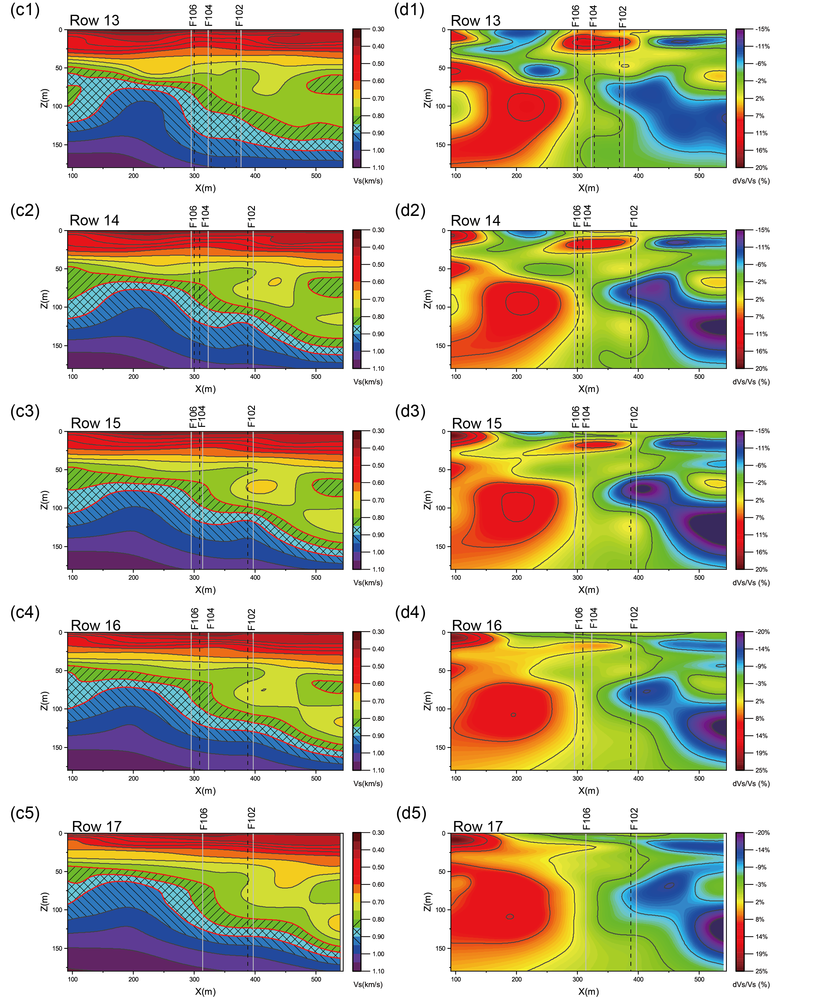
Figure 9. The vertical slices of (a) Vs model and (B) Vs perturbation within the fault trifurcation area (referenced in Figure 1(b) from Row 12 to Row 17). The vertical black dash lines and gray solid lines in each plot represent the fault traces estimated by USGS Dor et al. (2006) and Wade (2018), respectively. Three velocity contours are typically marked in (a) and (b) as different filling lines to visualize the variations better. The black solid lines indicate the reverse fault mechanism.
